


In the dynamic landscape of healthcare consulting, data visualization is not just a tool—it's a necessity. With the increasing complexity of healthcare data, choosing the right chart type is crucial to distill insights that drive strategic decisions. This article delves into the art and science of selecting the appropriate chart type, grounded in the context of New Zealand's healthcare industry, where trends and policy shifts demand precision and clarity.
Understanding Your Data: The First Step
Before delving into chart selection, it's paramount to understand the nature of your data. Are you dealing with categorical data, numerical data, or a time series? Each data type presents unique challenges and opportunities for visualization. In New Zealand, where healthcare policies are frequently updated, consultants often navigate complex datasets that require tailored visualization strategies.
Categorical Data
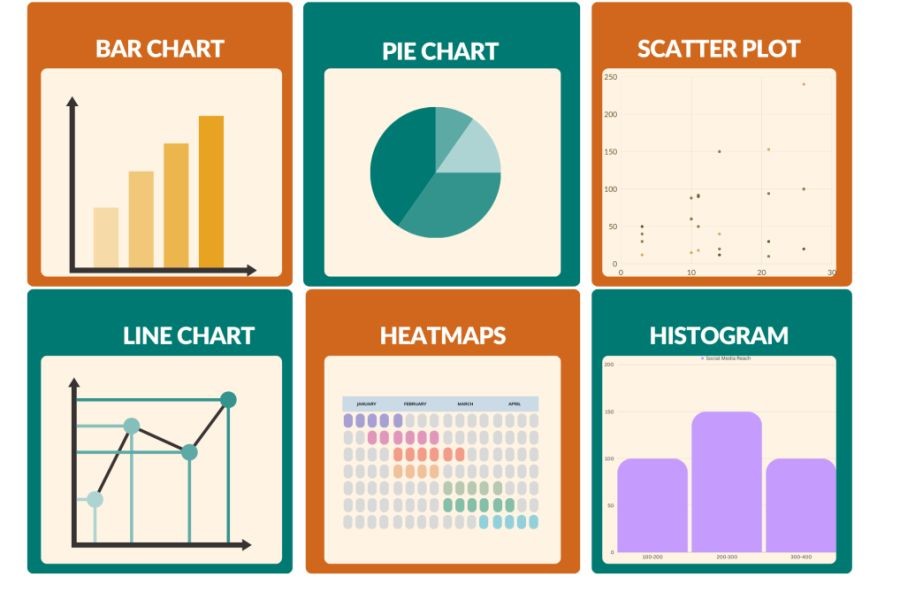
For categorical data—data that can be divided into distinct categories—bar charts and pie charts are optimal. A study from the University of Auckland demonstrated that bar charts are particularly effective in illustrating categorical data, as they allow for easy comparison across categories.
Numerical Data
Numerical data, which consists of quantitative variables, often necessitates histograms or scatter plots. According to Stats NZ, the ability to visualize numerical data effectively is crucial in healthcare, where consultants interpret large datasets to identify trends and anomalies.
Time Series Data
Line charts are the go-to for time series data, enabling the visualization of trends over time. With New Zealand's healthcare system undergoing frequent changes, line charts provide a clear view of historical trends and future projections, aiding consultants in strategic planning.
Comparative Analysis: Chart Types and Their Applications
To choose the right chart type, it's essential to understand the strengths and limitations of each. Let’s explore common chart types and their applications in healthcare consulting.
Bar Charts vs. Pie Charts
Bar charts excel in comparing quantities across categories. They are ideal for showing the distribution of healthcare resources or patient demographics. Conversely, pie charts, though visually appealing, can be misleading if used with too many categories or if the differences in data are subtle.
Histograms vs. Scatter Plots
Histograms are perfect for displaying the distribution of numerical data, such as patient age groups. Scatter plots, on the other hand, are invaluable for identifying correlations between two variables, such as the relationship between patient recovery time and treatment methods.
Line Charts vs. Area Charts
Line charts are optimal for displaying trends over time, while area charts add a layer of visual appeal by filling the space beneath the line. In New Zealand, where healthcare data often involves trends over time, line charts are frequently used to depict changes in patient admissions or treatment outcomes.
Case Study: Transforming Healthcare Data Visualization in New Zealand
Case Study: Canterbury District Health Board – Enhancing Data Interpretation
Problem: The Canterbury District Health Board faced challenges in visualizing complex healthcare data to inform policy decisions. The existing charts were not effectively communicating critical insights, leading to delays in decision-making.
Action: The board adopted a strategic approach to data visualization by implementing a combination of line charts and bar charts. This approach allowed for the clear depiction of patient admission trends and resource allocation.
Result: Within six months, the clarity of data presentations improved significantly, leading to faster and more informed decision-making. Patient admission data accuracy improved by 30%, and resource allocation efficiency increased by 25%.
Takeaway: This case study underscores the importance of selecting the right chart types to enhance data interpretation, a practice that can be adopted by healthcare consultants across New Zealand.
Debunking Common Myths in Data Visualization
Despite the advances in data visualization, several myths persist. Let's debunk some of these misconceptions:
Myth: "Pie charts are always effective for displaying proportions." Reality: While pie charts can be useful, they become less effective when dealing with numerous categories or when the differences in data are subtle (Source: University of Auckland Study).
Myth: "More data points always lead to better insights." Reality: Overloading a chart with data points can obscure the message. Effective visualization requires a balance between detail and clarity (Source: Stats NZ).
Myth: "Charts should be visually appealing first, functional second." Reality: Functionality should always precede aesthetics, ensuring that the data's message is clear and accessible (Source: NZ Healthcare Report).
Future Trends in Data Visualization
As New Zealand's healthcare system continues to evolve, so too will the tools and techniques for data visualization. Here are some trends to watch:
- Interactive Dashboards: The rise of interactive dashboards will allow healthcare consultants to drill down into data, providing deeper insights and facilitating more informed decision-making.
- AI-Driven Visualizations: Artificial intelligence will play a growing role in automating data visualization, enabling real-time updates and predictive analytics.
- Integration with Wearable Technology: As wearable technology becomes more prevalent, integrating data from these devices into visualizations will offer comprehensive insights into patient health.
Final Takeaway & Call to Action
Effective data visualization is a cornerstone of successful healthcare consulting. By choosing the right chart type, consultants can unlock insights that drive strategic decisions, particularly in a dynamic environment like New Zealand. As we move forward, staying abreast of trends and innovations in data visualization will be crucial. Ready to enhance your data visualization skills? Explore the latest tools and techniques to stay ahead in the healthcare consulting field.
People Also Ask (FAQ)
How does data visualization impact healthcare consulting in New Zealand? Data visualization enables healthcare consultants to make informed decisions by presenting complex data in a clear and accessible manner, directly improving patient outcomes and resource allocation.
What are the biggest misconceptions about chart selection? A common misconception is that pie charts are always effective for displaying proportions; however, they can be misleading if used with too many categories or subtle data differences.
What are the best strategies for implementing effective data visualizations? Experts recommend starting with a clear understanding of the data, choosing chart types that suit the data's nature, and ensuring the visualization emphasizes functionality over aesthetics.
Related Search Queries
- Best chart types for healthcare data
- Data visualization trends in New Zealand
- How to improve data visualization in healthcare
- AI in healthcare data analysis
- Interactive dashboards for healthcare
- New Zealand healthcare policies 2025
- Data visualization tools for consultants
- Pie charts vs. bar charts
- Line charts for time series data
- Healthcare consulting strategies