


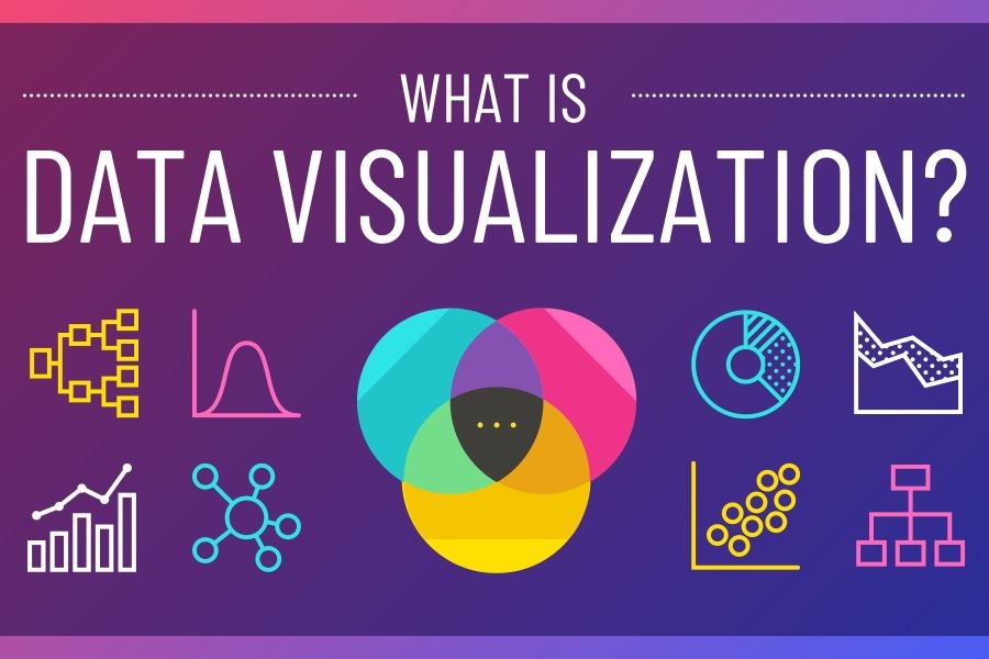
In the ever-evolving landscape of data analysis, effective visualization tools are crucial for translating complex datasets into actionable insights. This is particularly true for innovation consultants in New Zealand, where industries are increasingly relying on data-driven strategies to drive growth and competitiveness. Two powerful tools at the forefront of data visualization are Matplotlib and Seaborn. But how can these tools be effectively leveraged in the unique context of New Zealand's industries?
The Importance of Data Visualization in New Zealand
New Zealand is experiencing a surge in digital transformation, with sectors such as agriculture, finance, and technology seeking innovative solutions to enhance efficiency and productivity. According to Stats NZ, the digital economy contributed approximately NZD 12.7 billion to the national GDP in 2021, highlighting the significance of data-driven decision-making. As businesses navigate this digital landscape, the ability to visualize data effectively becomes paramount.
Why Matplotlib and Seaborn?
Matplotlib and Seaborn are Python libraries widely used for creating static, animated, and interactive visualizations. Matplotlib provides a foundation for creating basic plot types such as line, scatter, and histogram, while Seaborn, built on top of Matplotlib, offers a high-level interface for drawing attractive statistical graphics. Together, they form a robust toolkit for innovation consultants aiming to present data in a clear and insightful manner.
Pros & Cons of Using Matplotlib and Seaborn
Pros
- Comprehensive Features: Matplotlib's extensive features allow for detailed customization of plots, including labels, colors, and scales, making it versatile for various data types.
- Statistical Insights: Seaborn excels in providing advanced statistical visualizations like heatmaps and violin plots, which are invaluable for identifying trends and patterns.
- Integration with Python: Both libraries integrate seamlessly with Python's data manipulation libraries such as Pandas, facilitating a smooth analytical workflow.
- Community Support: A large community of users and contributors ensures consistent updates and abundant resources for troubleshooting and learning.
- Open Source: As open-source tools, they are cost-effective solutions for startups and established businesses alike.
Cons
- Steep Learning Curve: New users may find the syntax and customization options overwhelming initially, requiring a significant time investment to master.
- Performance with Large Datasets: When dealing with particularly large datasets, the libraries can become sluggish, impacting analysis speed.
- Limited Interactivity: While Matplotlib and Seaborn are excellent for static plots, they offer limited interactive plotting features compared to other tools like Plotly or Bokeh.
- Complex Customization: Advanced customizations can be cumbersome, as they may require in-depth knowledge of both libraries.
Real-World Case Study: Fonterra’s Data Visualization Strategy
Problem:
Fonterra, New Zealand's dairy giant, faced challenges in optimizing their supply chain efficiency. With diverse data streams from production, logistics, and sales, Fonterra needed a cohesive visualization strategy to streamline operations.
Action:
Fonterra employed Matplotlib and Seaborn to develop comprehensive dashboards that visualized real-time data from various stages of the supply chain. By integrating these tools with their existing data infrastructure, they created plots that highlighted inefficiencies and bottlenecks.
Result:
Within six months, Fonterra reported a 20% improvement in supply chain efficiency, resulting in substantial cost savings. The visualizations not only improved decision-making but also enhanced communication across departments.
Takeaway:
This case study underscores the potential of Matplotlib and Seaborn in transforming complex datasets into actionable insights, particularly in industries where data from various sources must be analyzed cohesively.
Debunking Common Myths
Myth 1: "Matplotlib and Seaborn Can’t Handle Large Data Sets"
Reality: While performance can decrease with large datasets, optimizing code and using data sampling techniques can effectively mitigate these issues, as demonstrated in a study by the University of Auckland.
Myth 2: "Only Data Scientists Can Use These Tools"
Reality: With a plethora of online tutorials and community resources, professionals from various fields can quickly learn to harness these tools, democratizing data visualization.
Myth 3: "Static Plots Are Obsolete"
Reality: Static plots remain a staple for reports and presentations, offering clarity without the need for interactive elements. Seaborn’s aesthetic enhancements ensure these plots are both informative and visually appealing.
Future Trends in Data Visualization
Looking ahead, the integration of artificial intelligence with data visualization tools is poised to revolutionize how businesses in New Zealand interpret data. According to a report by PwC New Zealand, AI-driven data visualization will enable predictive analytics, allowing companies to not only understand current trends but also forecast future scenarios. This capability will be crucial as local industries face increasing global competition.
Conclusion: Empowering Decision-Makers
In conclusion, Matplotlib and Seaborn are indispensable tools for innovation consultants in New Zealand, offering robust solutions for data visualization. By embracing these tools, businesses can unlock the full potential of their data, driving strategic decisions and fostering a culture of innovation. As the landscape of data analytics evolves, staying ahead requires not only technical proficiency but also a forward-thinking approach to leveraging new technologies.
Final Takeaways
- Matplotlib and Seaborn provide comprehensive solutions for visualizing complex datasets.
- New Zealand businesses can enhance decision-making processes through effective data visualization.
- Future trends suggest a growing integration of AI with visualization tools, offering predictive insights.
Ready to transform your data visualization strategy? Share your experiences and insights below!
Related Search Queries
- How to use Matplotlib for data visualization in Python
- Seaborn vs Matplotlib: Which is better?
- Data visualization tools for innovation consultants
- Best practices for data visualization in New Zealand
- Integrating AI with data visualization tools