4.2K Views· 24 January 2022
Transforming Your Space: Open Kitchen Remodel #42 - Bearing Wall Removal & Flush Mount Beam Installa
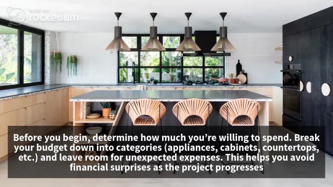
In this episode of our Open Kitchen Remodel series, we tackle the exciting transformation of a kitchen by removing a bearing wall and installing stylish flush mount beams. Watch as we break down the entire process step-by-step, ensuring you see the challenges and triumphs of a modern kitchen renovation. Join us as we explore essential concepts of structural remodeling and design. If you've ever wondered how to create an open-concept kitchen, this video is packed with tips on bearing wall removal, flush mount beam installation, and maintaining home safety during renovations. You'll learn about the tools and techniques required to successfully execute this kind of remodel while enhancing your home’s value and aesthetics. Whether you're a seasoned contractor or a homeowner dreaming of an open kitchen design, this video will equip you with valuable insights. Don't miss our expert advice, transformation footage, and inspiring ideas that can elevate your living space! Keywords: kitchen remodel, bearing wall removal, flush mount beams, open concept design, home renovation, interior design, modern kitchen transformation, DIY tips #KitchenRemodel #OpenConcept #HomeImprovement #InteriorDesign #RenovationProject #ConstructionTips #DIYHomeProjects
Watch more videos in this category: https://vidude.com/videos/category/770










1 Comments
FloreneCis
4 days ago